User-focused UX Designer interested in accessibility & efficiency.
CAPSTONE CASE STUDY
OnTrack
Introduction
BrainStation Capstone Project
Name - OnTrack
What - IOS mobile application for track cyclist
Duration - 6 Months
UX Research, UX design, Prototype testing, UI design
THE PRODUCT

OnTrack application allows cyclists to access a gear calculator, chart, average speed calculator and splits calculator offline. It tracks and organizes all data track cyclists may need in one place.
ABOUT
For our Capstone project at BrainStation we were asked to design a tool that would tackle and try to solve a problem. The Capstone project took place over 6 months while working on other school projects at the same time. The project asked that I identify, plan, research, and design a digital mobile interaction that addresses a problem space of our choosing. I choose to focus on track cycling as my problem space.
TRACK CYCLING
Track cycling is a cycling sport that takes place at a velodrome. The velodrome is a circular track on an angle, its premises can be indoor or outdoor. Due to the smooth floor which allows little friction, the curves in the track and not having obstacles such as cars, cyclists can accelerate to high speeds. Track cycling is a speed and tactic game.

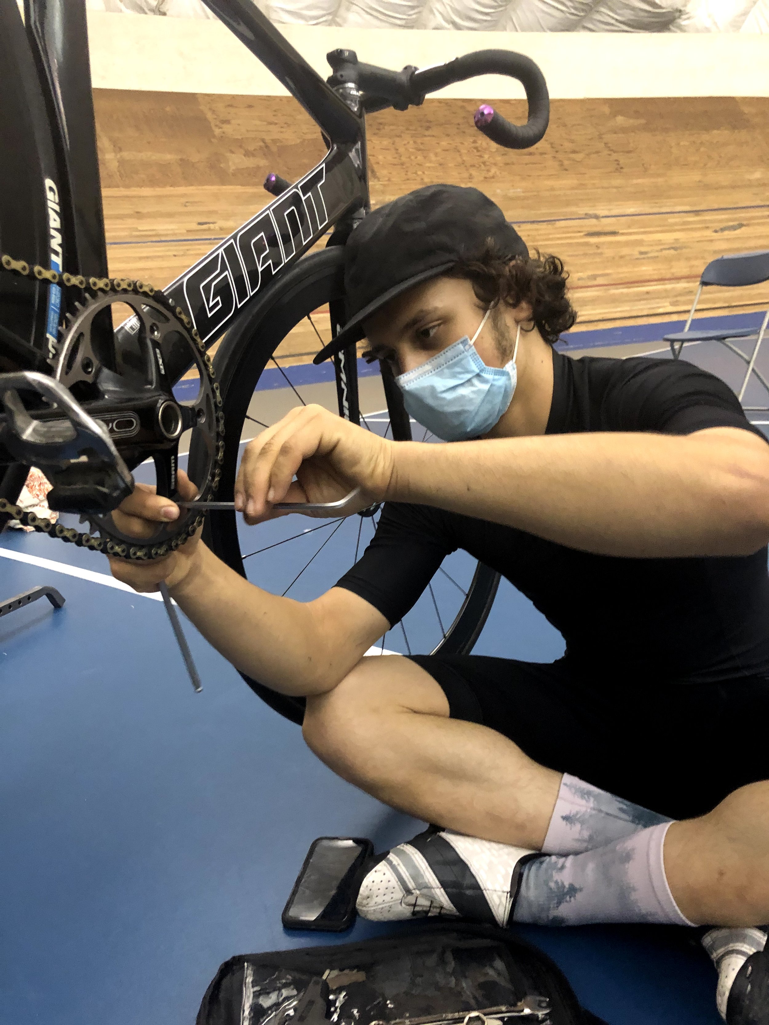
Cyclist racing at the Burnaby Velodrome
Every milli-seconds count for a track cyclist, it is the difference between a gold and a silver medal. Time is not only crucial on the track but also off the track. Warming up and preparing for the race is a huge part of performing your best. Time wasted on choosing and changing gears often affects the time one has left for warming up.

Cyclist ride around a velodrome
Track cyclist’s bikes have no brakes and only one gear. This means that is crucial the gear selected for each race is chosen with care. A gear that is too small may lead you to spinning out, meaning you may not be able to go as fast as your opponent. A gear that is too big might mean you will burn your legs out before passing the finish line, or you may not be able to get up to speed fast enough to catch a sprint.
Sage changing gear
UNIQUE ADVANTAGE
I am in an interesting position to research Track cycling as I am personally involved in the Vancouver track community. My partner, Sage, trains and races semi-professionally. I have been attending events and training at the Burnaby Velodrome for the past three years and know many of the riders who train there. This allows me to have a close understanding of the sport and allows me to observe problems the cyclist often experiences. This has given me great advantage to access interviews and to test the prototype on users that would actually represent the persona that would use this application.
Research
INITIAL RESEARCH
From my initial research I learned that currently there are no track cycling specific applications and no functional gear calculator application. One must jump between three different websites for their gear calculator, gear chart and average speed calculator to figure out the gear size they will need. This creates frustration, waste of crucial time and inconsistency when one cannot access signals or Wi-Fi.
Track cyclists have difficulty organizing all their track related data. Track cyclists are typically also road cyclists, as road cyclists they are used to amazing tools and applications such as Training Peaks, Strava and a cycling computer that automatically documents, organizes, and analyzes their road data. These tools do everything for them for their road training, yet they lack the same support for the track. Track cyclists do attempt to manually do what these applications do for them on the road but end up losing their track data instead.
PRIMARY RESEARCH
When I first began my initial research, I was looking at not only track cycling, but road cycling too. I started gathering information through looking at pre-existent applications and tools that the cyclist community were using and visiting problems cyclists had. I noticed that most problems regarding road cycling were already being tackled in different ways and for the problems that weren’t, were very specific to few riders. On the other hand, problems regarding track cycling seemed more prevalent through all track riders and no immediate tool could be found to help. Some of these problems included:
1. Difficulty tracking track cycling data and race specificities.
2. Loosing where information and data regarding gear size were kept.
3. Difficulty choosing gear size.
These were the most severe problems. If one can’t compare data regarding gear size from previous races, making gear decisions is a guess rather than intention. By not being intentional, riders would doubt their decisions and would change their gear again last minute. This is time consuming which diminishes the amount of time allocated on warming up or mentally preparing. Also, because data isn’t kept all in one place, it made it difficult to communicate crucial information with their coach or fellow riders before a race. Overall, the experience at the track in-between races could become stressful very quickly by things that could easily be avoided.
How Might We
How might we assist cyclists track bike data in an organized manner for the track?
THE GOAL
The goal of my Capstone would be to solve the problem track cyclists currently face regarding not knowing how to organize and track all information needed for their track training and racing. Ideally, this application would reduce stress and save time for cyclists between races and when changing gears. This can be measured as archived if the application makes gear choosing intentional, while also being fast, and easy to use. Furthermore, data would never be lost again, and cyclists would know exactly where to look to find their track data.
SECONDARY RESEARCH
Five cyclists were interviewed through virtual video on Zoom or by phone for 20-25 minutes.
The Participant Criteria started off with road and track cyclists who raced, the criteria narrowed mid-way through the interviews to semi-professional to professional track cyclist who race. This was due to some track cyclists that race at lower levels rarely change their gears. Some cyclists also primarily did road cycling and hadn’t raced the track in a few years, this makes it hard for them to recall their experience at the track.
The goal of the interviews was to first see if my assumptions, my results in my primary research, were correct. I needed to see if these were actual problems cyclists were facing and not just a hypothesis based on my understanding, observations, and tools research. I wanted to see if there were other problems I had missed or couldn’t understand. As of this point, I had assumed I knew riders process through observation and understanding my partner’s process, yet I knew all too well that each rider has a very particular way of getting ready for a race and training.
Questions -
The interview questions focused on track training and racing.
I wanted to know about:
Tools they used on and off the track for cycling.
What their process before, during and after training/racing looked like.
Their emotional experience during each step.
Where they need or use as digital support.
And since they know what they need to be their best, if there is something that is missing that they wish they had for support.
Findings -
Some key findings that were prevalent between the riders were:
1. Many cyclists are aware that they should be logging, collecting, and organizing their data. They understand that it would be beneficial to have yet not many take the effort to do so. This data often gets lost but more importantly doesn’t get used.
2. Track cyclists do not log/collect their track information as there is no automatic way to do so like there is for road cycling.
3. Most gear calculators aren’t very precise as there are missing factors into the equation such as the cyclist fitness and tiredness, the type of race, indoor vs outdoor track, the elevation, and temperature. They aren’t made for the track.
Quotes -
“(For a ‘gear calculator’) there’s already a website but not an app ...But I think the next level for a trackie, it’s one thing to have the calculator but it’s the next thing to say okay well here is my gear but now I want to add an event”
“It would be nice to have some pre-set values or some history of what you’ve done in the past (in the calculators)”
“It would be nice where, like on the track…if you put in the speed and it gave you different options for different cadence and different gearings…now that would be interesting.”
“Having all calculators in one place would be great. A negative splits calculator too though, now that would be nice.”
Overview -
The main problem was that there is no track specific tool for cyclists. Cyclists are used to tools that would document, organize and analyze their riding data when riding on the road. These tools do everything for them for road cycling but aren't supporting them on the track. Track cyclists unsuccessfully attempt to manually do what these apps do for them on the road and as a result lose their track data.
Reflections -
I feel that as much as I confirmed my own assumptions and received great points from my interviewees, though not all interviewees were ideal. One of them hadn’t ridden the track in a while and couldn’t fully recall her experience. Another wasn’t at a level of racing where he would change his gear and therefore track data collecting didn’t have the same importance. If time permitted, I would have redone a few of the interviews. I would have also interviewed more candidates as each rider does things a little differently and needs specific data for the specific type of races they are involved in. It is important to note that to properly do this research I would need to interview a few riders of each category (sprinter, TT, Omnium…). I would also focus on Cat A riders as they are the one with the highest need for data collection and the need to frequently change their gear.
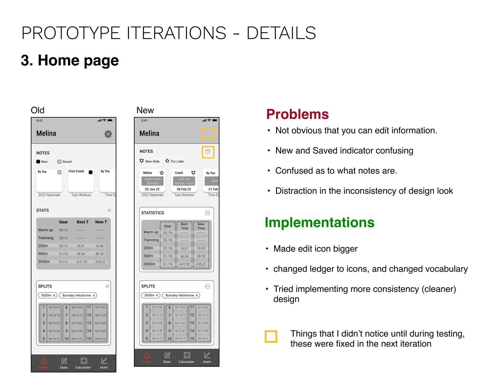
THE PERSONA

Joop Van Derhan
Cat 1 Road & Track cyclist
Discipline: Sprinter
Apps: Strava, TP, Zwift, Wahoo, Power2max
Joop is a semi-professional cyclist. His bike and fitness data are crucial to his training and races.
His coach and him are well organized when it comes to road cycling. They have a few cycling apps that connect together to gather all data in an easy and efficient manner.
Joop struggles to track cycling data. Because he has no tools to assist him, he does this manually, but he has a hard time keeping his notes organized. He never knows what gear to use and misses half of his warmup time changing gears.
TASK PRIORITIZATION
While keeping Joop, our persona’s needs and struggles in mind, an experience map of the current state was made, and 20 user stories were written.
From these stories, five main epic groups arise.
1. Saving data/information
2. Searching
3. Calculating
4. Planning
5. Time management
My final User Story is a combination of 3 stories,
As a track cyclist I want a tool that will do it all, (calculate, track my gears, distance, speed, average speed, RPM, Velodrome information, event names and dates) and then analyze that data while being individually flexible so that I can be more efficient in my training/races.
I knew the tool I was going to design was going to be for track cyclists, to assist them in training and racing whether they were at their local track or one they may have never ridden at. Cyclists were already using their phone to use web gear calculators; they were also used to having all their road cycling data on their phones. This made it logical that the tool should be designed as a mobile application. A mobile application would also allow users to access the calculators without Wi-Fi or data, which could occur when racing out of town. The application would be a place to store and analyze track data while also having access to calculators and a gear chart
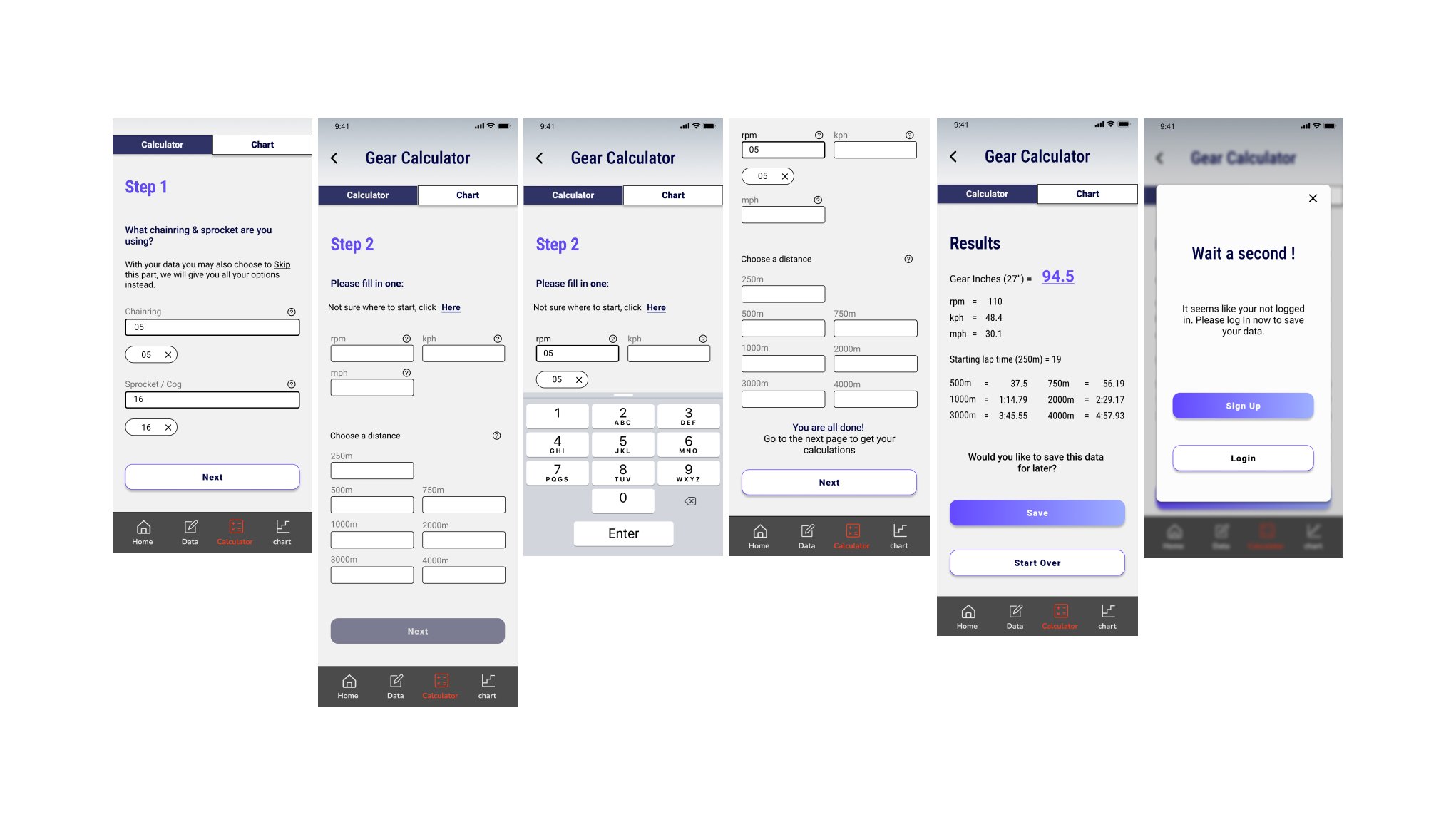
The most important are the gear calculator and gear chart, so I started with those while keeping in mind that eventually if time permits an average speed calculator, and a splits calculator (both regular and negative) would be added. Because the users are semi-to professional riders, flexibility and specificity in the calculator would be very useful, it would also set this application apart from anything that is out there. For this and the purpose of speed and efficiency the application would allow users to save preferences in a profile and the application over time could suggest data with saved information.
TASK FLOW
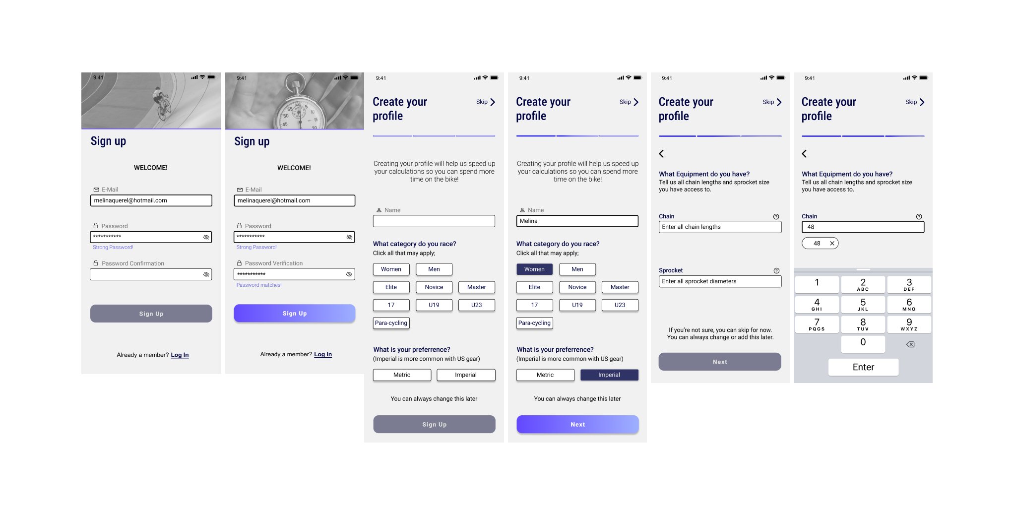
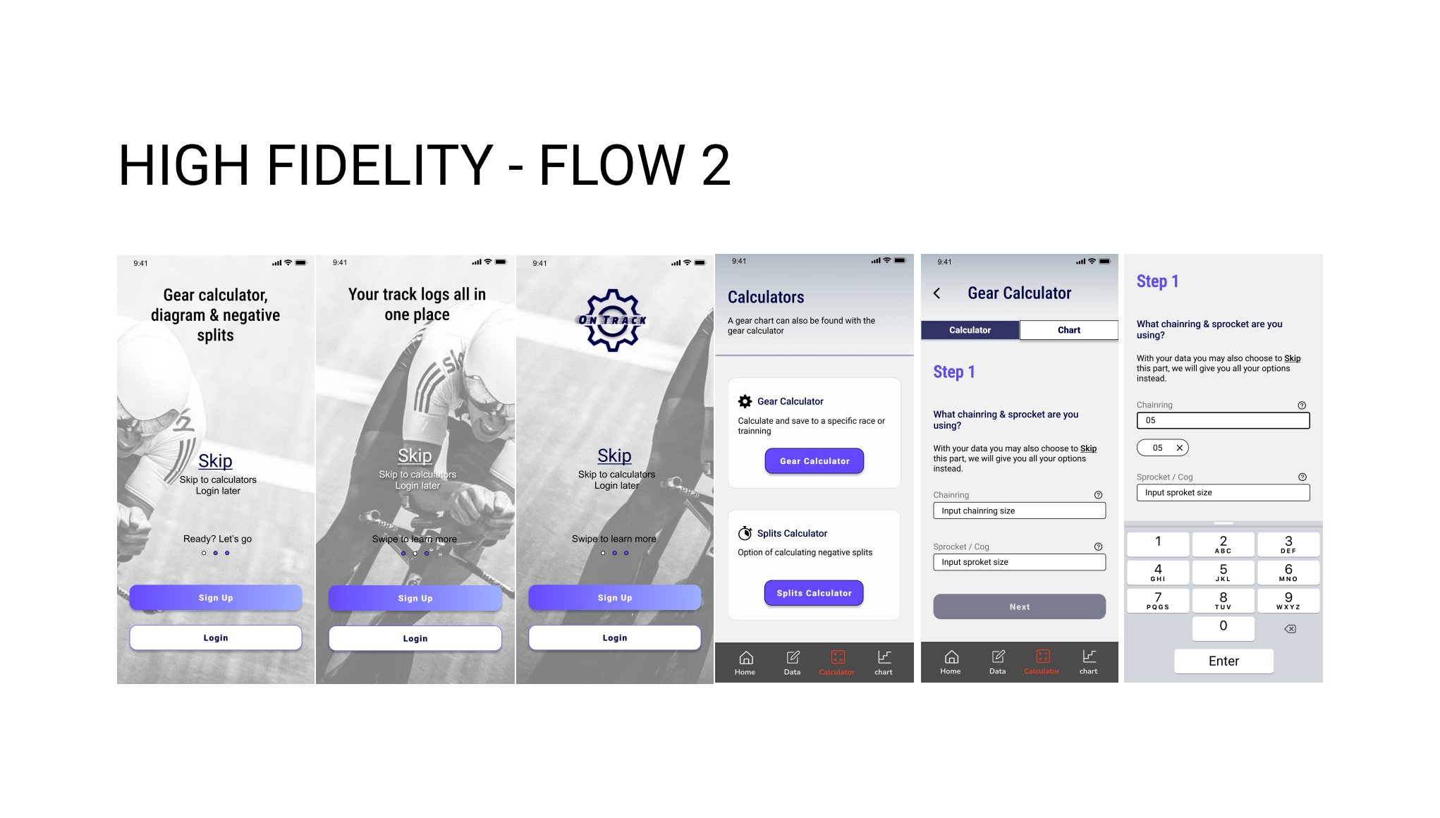
Two separate task flows were designed, one thinking of the user having just downloaded the application and creating a profile and the other user being in a hurry and needing to skip the Login/ Sign Up process to directly access the Gear Calculator.
1. Sign Up & Create a Profile with your preferences. Lands on Home Page.
2. Skip Login/Sign Up to Calculator, Calculate gear & Login after.
Designing
UI INSPIRATION BOARD
Before beginning sketching, I revisited applications and web pages cyclists were using to calculate their gear, gear charts and general digital cycling tools. It was important that this application used similar visual languages to applications such as Zwift, Strava and Training Peaks, as the user would be familiar with these. Out of the many gear calculators out there, I studied the ones cyclists I had interviewed and talked to enjoyed. I choose the applications and websites most popular with the cyclists as a primary source of UI inspirations. Some of the websites I was looking at included UCI, Tour de France, Rapha and EF. I also looked for specific component UI inspirations in other sports and data track applications.
SKETCHING
While sketching, I wanted to explore speed and efficiency as an experience while using the application. To put into context, if the user is in-between races when they first download the application, they would not have the time to sign up/log in, this made having access to the calculators without log-in important. Keeping in mind that the user wouldn’t be new to cycling tools, the visual language and cycling terminology used need to be accurate and resemble something they are used to. Because the user is semi-professional to professional, calculators that allow advanced specificities would be greatly useful.
A smaller issue that was brought up during observations and interviews was that to figure out what gear a rider needed, they would often need to go to three different websites and keep changing back and forth between pages to be able to access their average speed, the gear calculator and the gear chart. This was redundant and inefficient, having easy access to all three would be a goal.
Key features that I needed to keep in mind:
Gear Calculator
Gear chart
Average speed calculator
Splits calculator
Ability to remember gear user owns and preference to speed up process (for this data would either be accumulated through data saved over time or be incorporated in the creation of the profile as features user enters.)
Home/ key info page
Archives
An efficient way to organize and search information from archives (search bar? The user may be searching for different information and races from a few years back, therefore there should be different ways to search data. Tags (#) could be a way of searching could look at specific races e.g. 200m and more specifically fastest speed or by specific gear.)
Ability to add to the information collected for calculators (add race, notes, ...)
Remember email for quick login


Prototype
I went through three iterations; each prototype iteration had a series of 5 usability tests. The findings from the usability tests influenced the changes of each iteration.
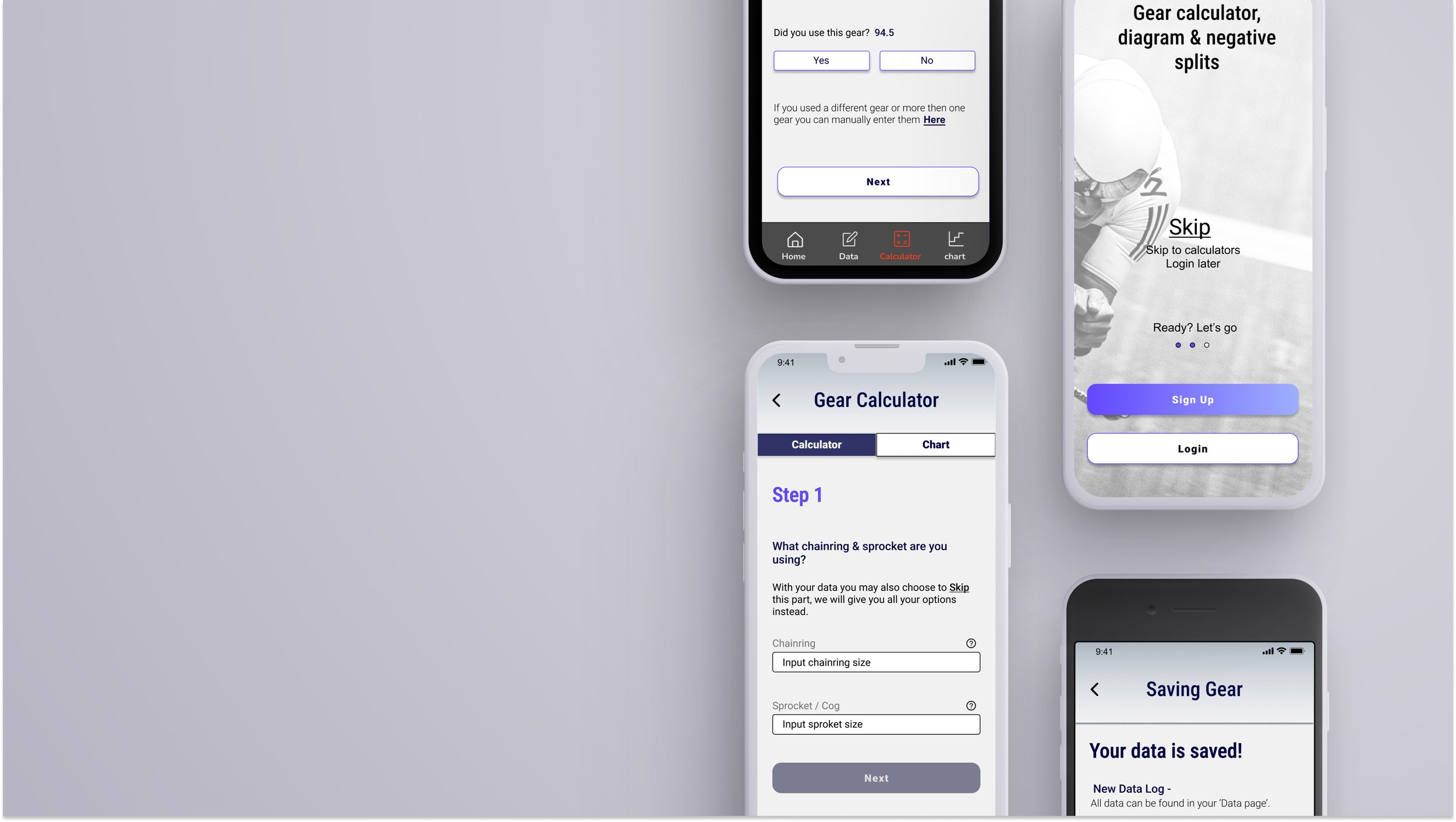
PROTOTYPE ITERATION #1
To see the prototype click HERE
USABILITY TESTING-
In my first iteration I had created two flows:
Flow 1 - You are in a hurry and just downloading the application; you need to find what gear you will be riding before the next race. You just want to use a quick calculator for now.
Flow 2 - You are new to the application; you want to sign up and create a detailed profile so in the future you can better select your gears and to collect data.
I had at first created two different gear calculators, a basic which you didn’t need to be signed in to use and the advanced that could be used after login. At the time this was my approach to solving the issue of the cyclist who between races, wanted to use a calculator, but didn’t have time to sign-up/log-in. It would also be a way to introduce the application while incentivizing the user to create an account. After two user tests and discussions with two instructors, I chose to change the design so the user could skip signing up/ logging in and go straight to the advanced calculators and could sign-in/ sign-up later if they wished to save the calculations.
The question, why even having a login/sign up to this application came up, which was a good point. Because a large amount of data would be saved and potentially shared with a coach it is important that the data is associated with a specific rider as a coach may have multiple riders in training. Furthermore, cyclists love to nerd out about gear and data, creating a personal experience where one feels they can be as precise as they wish would create enjoyment to the user. If the process isn’t easy or personalized, riders usually do not use the application long, this was discussed with riders when they talked of other applications they used and had used.
I cut out the first flow partway through my interviews but finished my interviews and started working on redesigning my onboarding screens, so the user could skip straight to the calculators. I chose to finish my usability test for my second flow.
FINDINGS-
After my first round of testing, I had a list of tasks I had to redesign and finish and a list of issues that arise. I placed all the issues and problems on a prioritization matrix to help me decide what to prioritize with the amount of time I was allocated. I started off by tackling some of the bigger issues and then tried getting all the quick wins with higher positive impact.


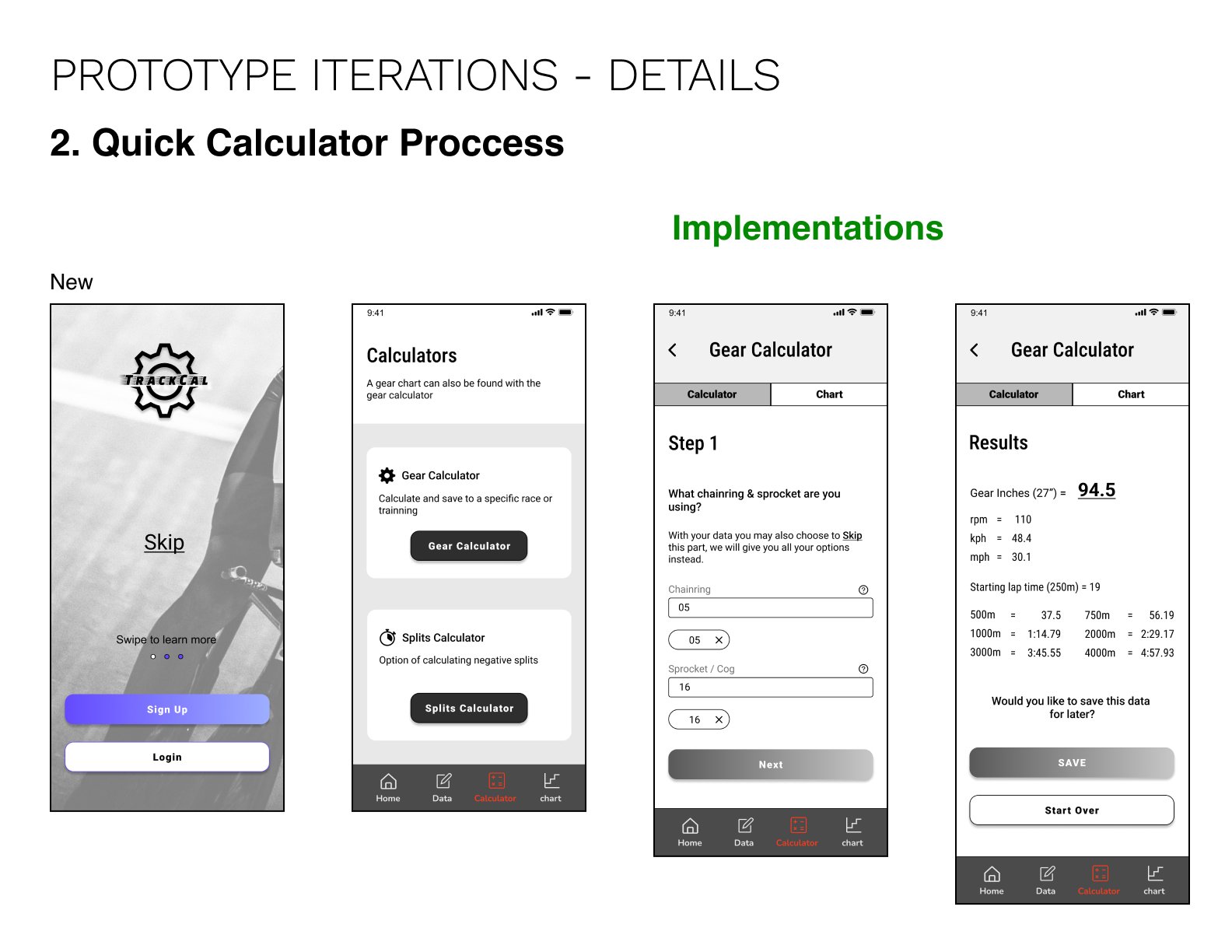
PROTOTYPE ITERATION #2
To see this prototype click HERE
USABILITY TESTING-
Flow 1 - You are a new user who needs to Sign Up and set a profile.
Flow 2 - You are already a user. Today you are in a hurry and just need quick access to your gear calculator. Once using the calculator, you want to save the data. You must log in and save your data.
Due to time limitation I choose to focus on tackling quick fix, these were found doing a prioritization matric, and one page that had a many different issues.
The ‘Skip’ on onboarding is confusing – This was replaced by ‘Skip to calculators’
Transition is too slow between onboarding and pages- speed dissolve to 500m
Sprocket enter, jumps up - Changed the prototype interaction
‘Option 1’ and ‘option 2’ on save data page is confusing – Redesigned for clarity
To save log after log in, wrong highlight - change colour
“would you like,” too far from CTA - Bring “would you like,” closer to CTA

PROTOTYPE ITERATION #3
To see this prototype click HERE
This third iteration was the version turned into my first iteration of my Hi-Fidelity.
Reflections of Mid-fi-
Through this process I learned so much about track cycling gears, data and other cyclists’ methods of tackling data from their training and races to become better cyclists. Even with all the research I did, I do not yet have enough knowledge to tackle the split calculator.
I was losing a lot of time as I was trying to prototype the whole application at first instead of just prototyping out my flow.
Designing
BRAND DEVELOPMENT-
Before turning my Mid-Fi into a Hi-Fidelity I had to do a bit of brand development. Brand development started earlier in the project while researching cycling applications and websites. Visual influences also came from top cycling brands and colours used on new bikes and kits. The application name changed from TrackCal to OnTrack, this was a play of words that was chosen in collaboration with participating track cyclists, it made sense that the user would be the best collaborator to influence this decision.
MOODBOARD-
Taking into consideration the users and what was current, recognized but also in style in the cycling community the mood board represented something more cosmic, fast, nuclear and vibrant. On the other hand, I wanted the brand to be less earthy, slow, natural, and dull.

fast, sleek, snazzy, stylish, sharp, elevate
WORDMARK-
To begin, I went and studied some of the top cycling brands' logos and wordmarks. I want to put an emphasis on Rapha and EF as they are the leading well-designed kits.
I also noticed many cycling brands have slight italic, bold and sharp letters
As the Logo and wordmark are an extension and a representation of the brand like its name, OnTrack, I was playing around with the visual of the title being on a track. I was also playing around with a gear as it is what keeps the rider literally on track. I was also taking into account how bikes’ paint colours often create neon lights effect; this was something I tried to integrate into the logo.

OnTrack Wordmark

Inspirations

LOGO-
The initial logo was a quick iteration done for the purpose of the mid-fi prototype. My new version ironically ended up not working as well in my hi-fi with the look and the feel of the application, so I ended up going back to an upgraded version of my first iteration. Its effortless simplicity didn’t distract from my onboarding flow.

The first version

Second version
APPLICATION ICON-
I wanted to make sure that my icon wasn’t going to resemble any of my cycling applications or other apps and for it to be easily seen. Many of the track cyclists I talked to said that they often identify applications on their phones by colour and location. Most cycling application icons are blue, orange, or red with white letters or symbols. I decided to go with my primary colour of purple with a pop of my secondary yellow. My first version included my first OnTrack logo, concerns arose regarding legibility on a small screen. This wasn’t something I had considered. My second iteration largely spelled ‘OT’.
The first version

Second version
UI LIBRARY -

Hi-Fidelity
Reflecting on my Mid-Fi while taking into consideration brand development research I have decided to re-use icons previously used such as the ones found in the navigation bar, sign up/sign in pages and error/correct state. They fit with the mood of the app while also being well received in user tests.
Images have also been kept, and a few more added. The images need to be track specific and to evoke excitement with riders, a reminder, or the joy of riding the track.
Flow #1
To see this prototype click HERE


Learnings & Next Steps
The more I work on this project the more I am realizing that I am just at the beginning of this project. At first only a few seemed to understand what I was thinking about when I talked of the importance of organized data for track specific cycling. The more I talk about and share my prototype, the more excitement I get from people in the track cycling community in Vancouver.
Reflecting on my journey designing OnTrack I there are many things I wish I would have done differently, or I would have failed earlier in the process. Starting off, my calculators need more work, this whole project could have been focused on just one calculator. I now understand that just tackling the gear calculator needs many different sketch iterations and testing with the right group of cyclists that would best represent the user. I spent too much time on the onboarding experience and creating a profile when the focus of the tool was its calculators. I felt like throughout the project I kept having conversations with certain cyclists a little too late, key information would come in conversations in later iterations. Due to time limitations, I couldn’t always start from scratch certain sections though I now know them to not be ideal. With the knowledge I have gained from this project I do wish to revisit it in my free time and hoping to complete the three calculators.
My next steps would be to finish designing other parts of the application such as the average speed calculator and the negative speed calculator. But first I would like to do a new round of testing with a specific group of users (track cyclist cat A) to try to make the gear calculator more refined and more time efficient. This is important as this would be the trigger that would or wouldn’t break the app. I am aware that the application is far from being a ready and running application, but I do believe that this is a tool missing for track cyclists. With a few more iterations and some refined pixel pushing it would become very close to being a tool that could be used.